Create a Dark Mode toggler with Tailwind ⚡️
Learn to setup Dark Mode toggle in React!

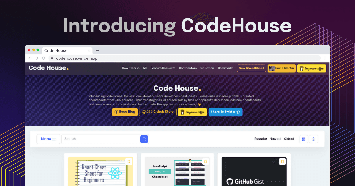
Savio Martin is a 14 year old who spends time building useful products. He is a designer, front-end web developer, and content creator.
Hello Folks 👋
This is Savio here. I'm young dev with an intention to enhance as a successful web developer. I love building web apps with React. I have proved my superiority in frontend technologies.
Today, I'll show you the easiest and the effective way to set up dark mode toggler in your tailwind app. 🚀. So, be with me! Let's code something amazing!
Create React App
First of all, we first have to create a react app. You know it!
npx create-react-app firebase-auth
Setup Tailwind
Setting up tailwind is a bit lengthier process, I have already written an article that makes everything easier. So, I ask you to come back here after following this article. I'm sure you'll make everything fast 🚀
Working on Toggler
After completing these steps, we're now in a position where we could use tailwid in our app. Now, the next step we should do is to create a dark mode toggler. As of now, here is our file tree 🌲
src/
├── styles/
         ├── output.css
         └── tailwind.css
├── App.js
└── index.js
App.js is the main place of our code. It act as our home page. FIrst of all, we need a switch for toggling, so, lets create one. Here goes the sample code ⬇️
return (
  <div class="h-screen w-full flex items-center justify-center bg-blue-600 flex-col">
      <label class="switch">
          <input type="checkbox" />
          <span class="slider round"></span>
      </label>
  </div>
);
We cannot handle the switch completely with the tailwind, so, I'm gonna create a new file inside styles called App.css. And then, I'm importing it to the App.js
import "./styles/App.css";
I'm then importing output.css in our App.css. Why I did this because we're not gonna fully rely on tailwind for the switch, we're writing so on our own and need this to work. So, here goes the code for App.css ⬇️
@import url(./output.css);

.switch {
  position: relative;
  display: inline-block;
  width: 60px;
  height: 34px;
}

/* Hide default HTML checkbox */
.switch input {
  opacity: 0;
  width: 0;
  height: 0;
}

/* The slider */
.slider {
  position: absolute;
  cursor: pointer;
  top: 0;
  left: 0;
  right: 0;
  bottom: 0;
  background-color: #ccc;
  -webkit-transition: 0.4s;
  transition: 0.4s;
}

.slider:before {
  position: absolute;
  content: "";
  height: 26px;
  width: 26px;
  left: 4px;
  bottom: 4px;
  background-color: white;
  -webkit-transition: 0.4s;
  transition: 0.4s;
}

input:checked + .slider {
  background-color: #2196f3;
}

input:focus + .slider {
  box-shadow: 0 0 1px #2196f3;
}

input:checked + .slider:before {
  -webkit-transform: translateX(26px);
  -ms-transform: translateX(26px);
  transform: translateX(26px);
}

/* Rounded sliders */
.slider.round {
  border-radius: 34px;
}

.slider.round:before {
  border-radius: 50%;
}
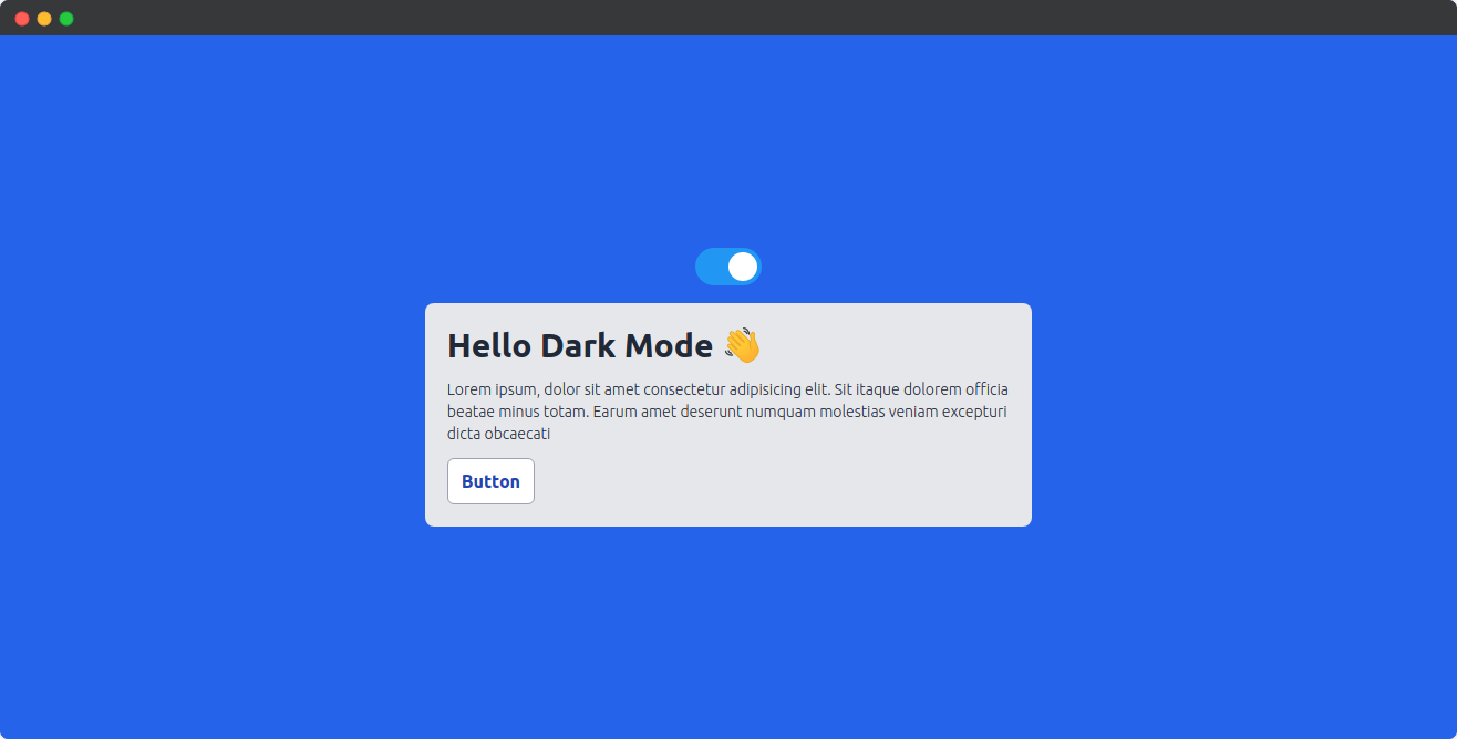
Now, let's create an inner box with tailwind. As default, we're gonna use light mode. So, here goes the code for the box 👇
<div className="h-5/12 w-5/12 bg-gray-200 p-5 rounded-lg mt-4 text-white">
    <h1 className="text-gray-800 font-extrabold text-3xl">
        Hello Dark Mode 👋
    </h1>
    <p className="text-gray-800 font-light mt-3 text-sm">
        Lorem ipsum, dolor sit amet consectetur adipisicing elit. Sit itaque
        dolorem officia beatae minus totam. Earum amet deserunt numquam
        molestias veniam excepturi dicta obcaecati
    </p>
    <button className="bg-white py-2 px-3 font-bold text-blue-800 mt-3 rounded-md border border-gray-400">
        Button
    </button>
</div>
Now, if we run the project with npm start, we can see this in our browser ⚡️
Now, it is time to work on Dark Mode. Lets head over to tailwind.config.js. Here you can see an object called darkMode that is set as false by default, lets change this to class. See the code ⬇️
module.exports = {
  darkMode: "class",
}
Now, let get back to our App.js and create a useState object called darkMode 👇
const [darkMode, setDarkMode] = useState(false);
And, now in our switch, we can change the darkMode to true or false on every click. Here is the code for the switch ⬇️
<label class="switch">
    <input type="checkbox" onClick={()=> setDarkMode(!darkMode)} />
    <span class="slider round"></span>
</label>
This will change our darkMode variable to true or false on every change. To reflect the change, we are gonna make a small code that will add a dark class to our home page if the darkMode is true. Here is the code ⬇️
<div class={`h-screen w-full flex items-center justify-center bg-blue-600 flex-col
${ darkMode && "dark" }`}>
</div>
Now, let check it by opening devtools or Ctrl + Shift + I
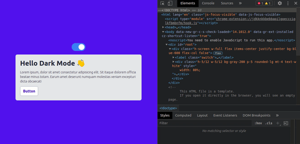
🎉 Yep, everything is now working, we can see if darkMode is true, a new class dark is assigned to it. Now, lets change the content according to it.
Tailwind asks you to follow this work. We can add a class dark:bg-blue-900, it will work whenever the parent is on darkMode. So, here goes the complete code for App.js ⬇️
App.js
import React, { useState } from "react";
import "./styles/App.css";

const App = () => {
  const [darkMode, setDarkMode] = useState(false);

  return (
    <div
      class={`h-screen w-full flex items-center justify-center bg-blue-600 flex-col ${
        darkMode && "dark"
      }`}
    >
      <label class="switch">
        <input type="checkbox" onClick={() => setDarkMode(!darkMode)} />
        <span class="slider round"></span>
      </label>
      <div className="h-5/12 w-5/12 bg-gray-200 dark:bg-gray-900 p-5 rounded-lg mt-4 text-white">
        <h1 className="text-gray-800 dark:text-gray-200 font-extrabold text-3xl">
          Hello Dark Mode 👋
        </h1>
        <p className="text-gray-800 dark:text-gray-200 font-light mt-3 text-sm">
          Lorem ipsum, dolor sit amet consectetur adipisicing elit. Sit itaque
          dolorem officia beatae minus totam. Earum amet deserunt numquam
          molestias veniam excepturi dicta obcaecati
        </p>
        <button className="bg-white dark:bg-gray-800 py-2 px-3 font-bold text-blue-800 dark:text-white mt-3 rounded-md border border-gray-400 dark:border-gray-600">
          Button
        </button>
      </div>
    </div>
  );
};

export default App;
Now, let's test our App 🚨
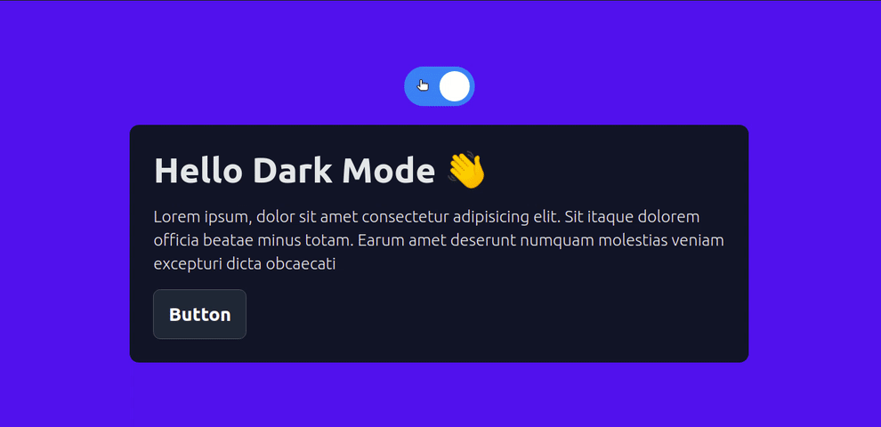
🥳 Congrats friends, everything is working as expected. I hope you enjoyed the whole journey 🚀
👀 Wrapping Up
Yeah, that's a wrap. Hope you enjoyed the article. Do not hesitate to share your feedback. I am on Twitter @saviomartin7. Give a follow!
Follow me on Github @saviomartin, Don't miss my amazing projects! 💯
I hope you learned to set up Dark Mode. Feedbacks are greatly appreciated! 🙌 Have an amazing day!
🌎 Lets connect
🙌 Support
My projects are fueled by coffees ☕, get one for me!